
Good YouTube thumbnail examples are not copies of one visual style. A tutorial, a review, and a podcast clip ask for different layout priorities. This guide shows ten repeatable patterns you can reuse across videos, then swap the photo and the title.
Each figure below is a 1280×720 export from a FeatureImg YouTube thumbnail template. The layout is the constant. The episode copy is the variable.
All of these sit on a 16:9 canvas. For pixels, file types, and crop behavior, see the YouTube thumbnail size guide.
| Thumbnail type | Best for | Main visual pattern |
|---|---|---|
| Tutorial | How-to content | Clear topic + short promise |
| Review | Product tests | Product + verdict cue |
| Comparison | X vs Y videos | Split layout |
| Product demo | SaaS / software | UI + concise value |
| Education | Explainers | Concept + readable label |
| Podcast | Interviews | Faces + episode topic |
| List / roundup | Top-N content | Number + one supporting image |
| Launch | Announcements | Product + short cue |
| Commentary | Analysis | Subject + short stance |
| Minimal | Editorial series | One title, restrained image |
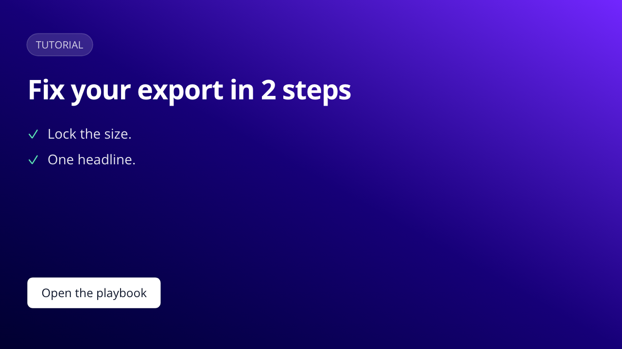
Tutorial thumbnail
Best for: how-tos, guides, walkthroughs.
Layout: a short outcome title plus a tiny checklist. Skip extra photos.
Why it works: viewers can name the skill before they read the video title.
Reusable rule: one topic, one promise, a few steps at most.
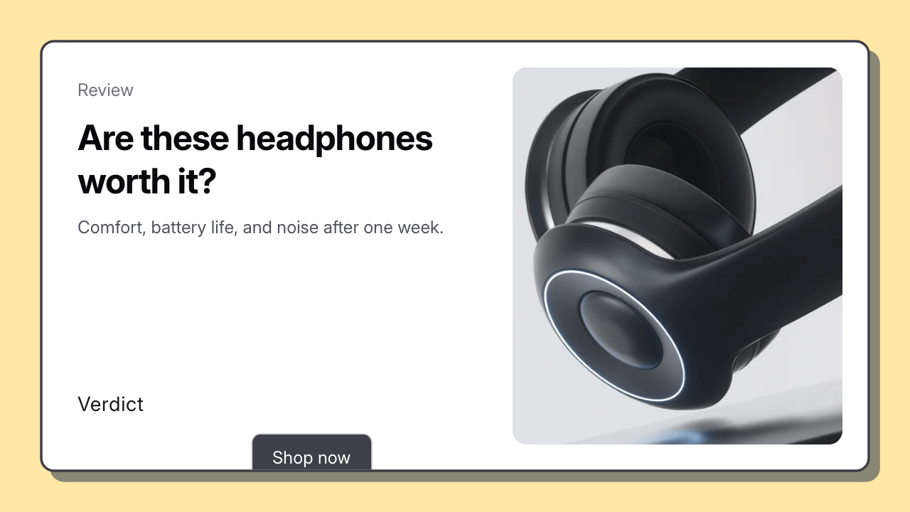
Product review thumbnail
Best for: hardware tests, software reviews, first looks.
Layout: the product or interface as the primary subject, plus a short evaluation cue. Skip stacks of badges.
Why it works: the object is recognizable at grid size. The cue tells people this is a verdict, not a launch ad.
Reusable rule: one product, one question or verdict, no extra seals.
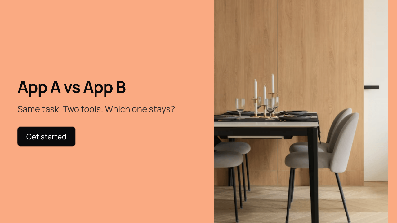
Comparison thumbnail
Best for: tool A vs tool B, before/after, two workflows.
Layout: a split canvas. Put the vs line in the title. Keep one supporting image, not two logos fighting for space.
Why it works: the vs structure is obvious even when the image is small.
Reusable rule: one vs headline, one visual, equal type hierarchy.
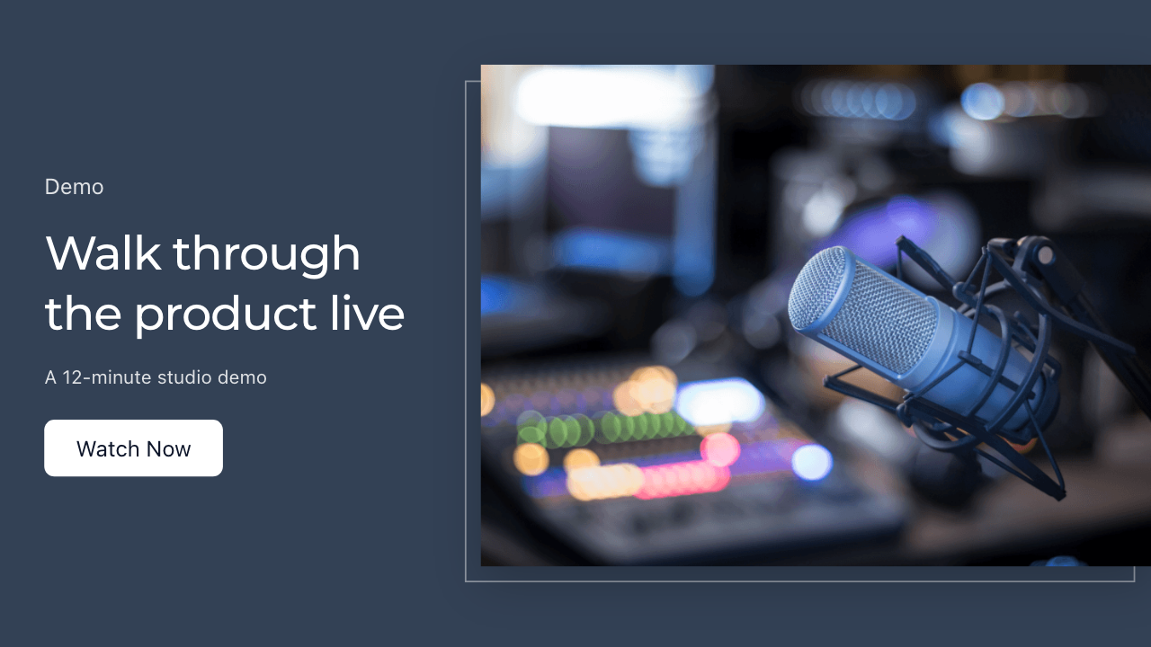
SaaS / product demo thumbnail
Best for: walkthroughs, feature tours, startup demos.
Layout: a wide media panel on one side, a short value line on the other. Hide tiny dashboard labels.
Why it works: software videos need proof that there is a session or product, plus a promise that fits one glance.
Reusable rule: media as proof, text as the value, never both competing in the same zone.
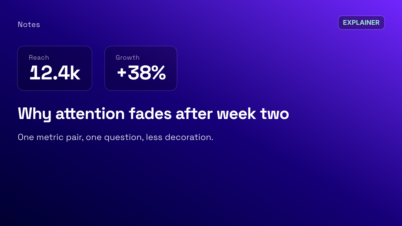
Educational / explainer thumbnail
Best for: concepts, business explainers, classroom-style channels.
Layout: a couple of large figures or labels, plus a readable question.
Why it works: the numbers or diagram are the hook. Extra decoration makes the concept harder to see.
Reusable rule: one metric pair, one question, empty space around both.
Podcast / interview thumbnail
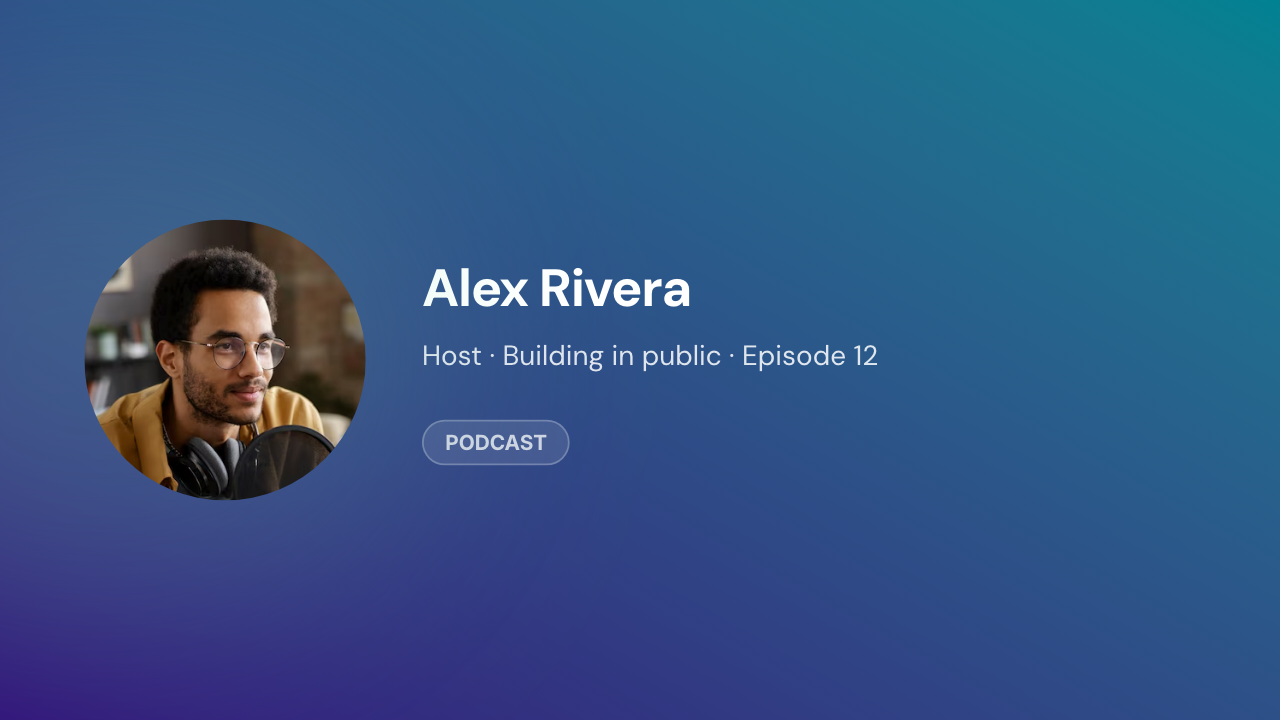
Best for: podcast clips, interviews, guest conversations.
Layout: one or two faces, a name or topic line, and a series cue such as an episode number.
Why it works: faces help recognition. The topic still has to be on the image, or the clip looks like a random talking-head.
Reusable rule: keep the same portrait positions and bar for the whole series; only swap faces and titles.
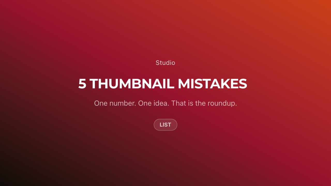
List / roundup thumbnail
Best for: “5 tools”, “10 mistakes”, numbered roundups.
Layout: a prominent number in the title and a short supporting line. Do not try to show every list item.
Why it works: the number is the category. Extra icons become noise.
Reusable rule: one numeral, one phrase, empty space.
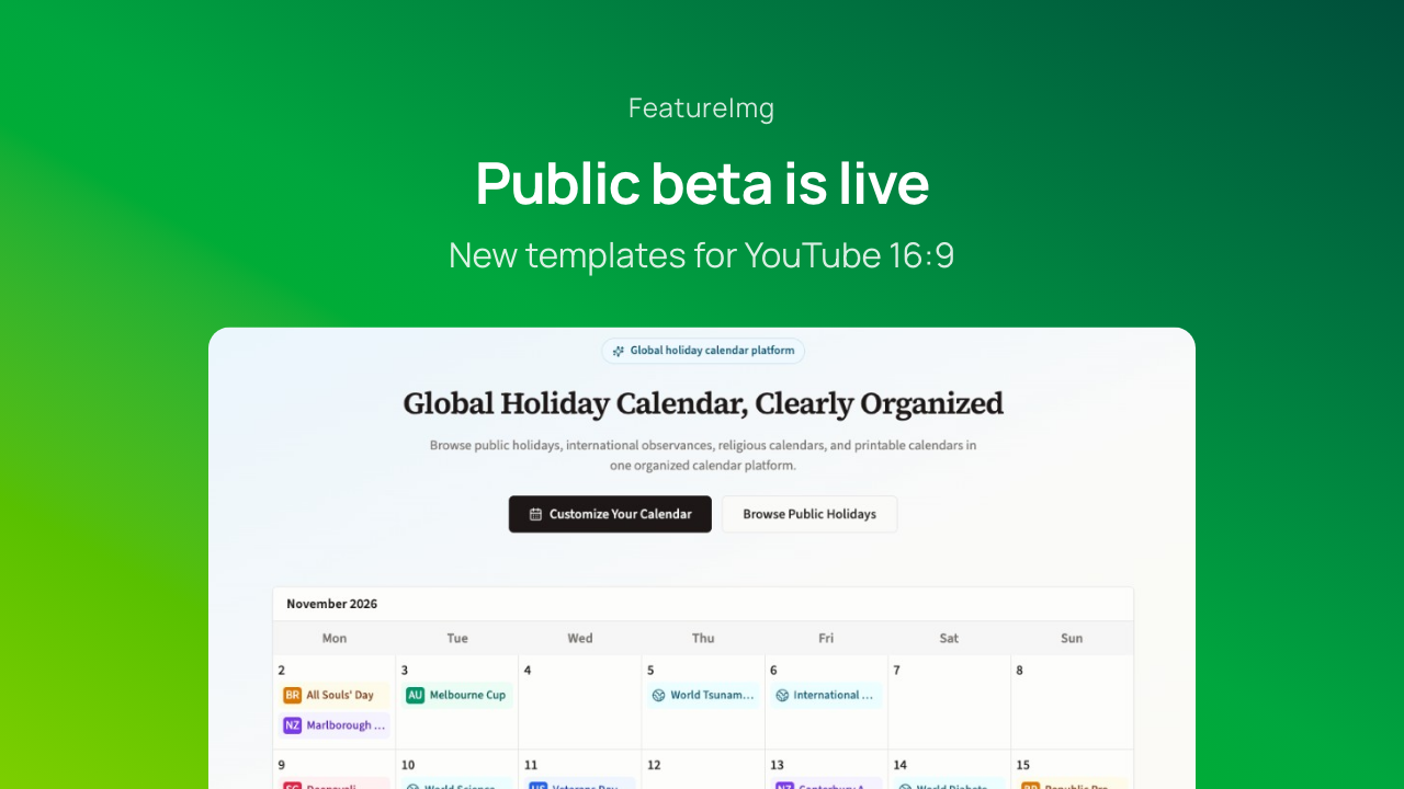
Product launch thumbnail
Best for: feature announcements, release videos, public betas.
Layout: a product or feature visual, a short announcement phrase, and a restrained footer.
Why it works: launches need “what shipped,” not a paragraph of changelog text.
Reusable rule: one visual, one announcement, one next-step line.
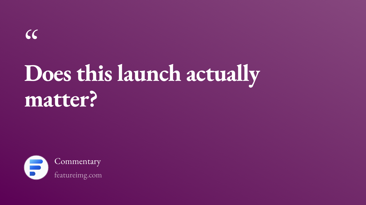
Commentary / opinion thumbnail
Best for: analysis, reactions, industry takes.
Layout: a short stance or question in large type, plus a small author mark. Skip exaggerated expressions.
Why it works: the stance is the content. A clear question is enough.
Reusable rule: one sentence, one attribution, no extra stickers.
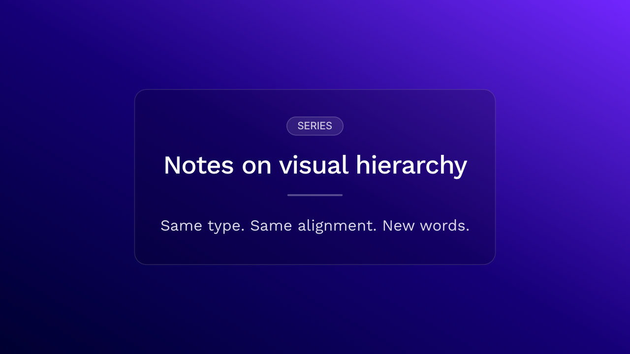
Minimal text-first thumbnail
Best for: editorial creators, professional brands, recurring series.
Layout: a simple background, a large title, consistent type, little or no photography.
Why it works: if the series is already known, the title can carry the frame. This is the template-first version of a thumbnail.
Reusable rule: same type size and alignment every week; only the words change.
What good YouTube thumbnail examples have in common
The layouts above look different. They still share a few habits:
- One dominant idea
- A clear hierarchy between type and image
- Type that still reads when the player is small
- A 16:9 frame that you reuse
- A series system (same bar, same type, same portrait slot) when you publish often
There is no universal formula. A list video and a podcast clip should not share the same composition.
How to reuse these layouts without making every thumbnail look the same
Keep the system: spacing, type scale, and where the photo sits. Change the image, the title, and any supporting graphic. Viewers still recognize the channel. Each video still looks like its own topic.
That is the same idea as a template: the layout is the constant, the episode is the variable. Browse more starting points in the template gallery if you want a locked 16:9 frame.
When to use a template
A template helps when you upload on a cadence, run a branded series, or work without a designer on every file. You pick the pattern once, then replace copy and imagery.
To create a YouTube thumbnail from a locked canvas, start on the YouTube format page. For the step-by-step edit path, see how to create a YouTube thumbnail.