When someone shares your link, the preview image is often the first visual impression they get. Getting the open graph image size right keeps your headline readable, your branding intact, and your layout from being cropped in odd ways. This guide explains the dimensions that work well in practice, where OG images show up, and how to produce a file you can upload with confidence.
What is an Open Graph image?
An Open Graph image is the picture platforms pull from your page metadata, usually through the og:image tag. It appears in link previews on social networks, messaging apps, Slack-style tools, and many CMS preview panels before publish.
The image does not replace your page content. It is a compact visual summary: often a title, a short subtitle, and simple brand cues. Because previews are small, size and contrast matter more than decorative detail.
Recommended Open Graph image size
The most widely compatible OG image size for new projects is 1200 × 630 pixels. That ratio is close to 1.91:1, which matches what Meta, LinkedIn, and many documentation examples describe for link previews.
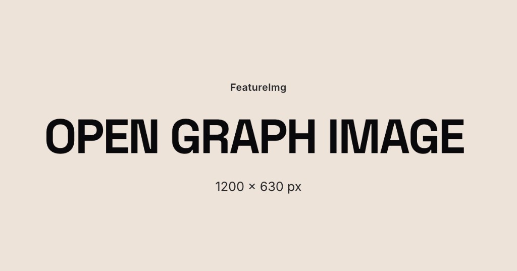
FeatureImg’s Open Graph format exports at 1200 × 630 px so you do not need to resize after design.
| Label | Dimensions | Aspect ratio | When to use |
|---|---|---|---|
| Standard OG (recommended) | 1200 × 630 px | ~1.91:1 | Default for blogs, SaaS pages, and landing pages |
| Minimum practical | 600 × 315 px | ~1.91:1 | May look soft on retina displays; avoid if you can |
| Square (platform-specific) | 1200 × 1200 px | 1:1 | Only when a channel explicitly requires square art |
If you are comparing open graph image dimensions across tools, prioritize matching aspect ratio first, then meeting or exceeding 1200 px width for the wide layout.
Why 1.91:1 works well for social previews
Wide rectangles match how most link cards are laid out: image on top or left, title and URL beside or below. A consistent ratio reduces accidental letterboxing (empty bars) or center crops that cut off your headline.
A fixed canvas also speeds up production. You design once at the correct og image size, export, and reuse the same layout family for product updates, changelog posts, and blog announcements.
Where OG images appear
You will see Open Graph previews in places such as:
- Facebook and LinkedIn link shares
- iMessage and other chat link unfurling
- Slack and team chat link previews
- Some newsletter and CMS “social preview” panels
- Developer tools that read
og:imagewhen debugging metadata
Each client may crop slightly differently, which is why safe margins and readable type size matter more than pixel-perfect edge alignment.
Best practices for Open Graph images
Keep the title readable. Aim for a short headline (often five to eight words). Preview thumbnails are small; long sentences become illegible.
Avoid text near the edges. Stay inside the central area of the frame. Badges, rounded corners, and automatic crops can clip corners.
Use strong contrast. Light text on a busy photo often fails after compression. Solid backgrounds, simple gradients, or a clear text panel usually hold up better.
Keep brand elements simple. A logomark, one accent color, and a single font style read better than a full brand guidelines poster squeezed into a preview.
Preview before publishing. Use your platform’s sharing debugger or share a private link to confirm the image, title, and description together.
Common mistakes
Wrong ratio. Uploading a tall portrait or square image into a wide OG slot leads to crops you did not intend.
Too much text. Body copy belongs on the page, not on the preview image. One headline and optional subtitle is enough.
Low contrast. Thin gray text on pastel backgrounds disappears at small sizes.
Relying on random images. Pulling any page image into og:image often produces off-brand or cropped results. A dedicated OG asset performs better.
How FeatureImg helps you hit the right size
FeatureImg is built around preset formats so you stay on-canvas while you design:
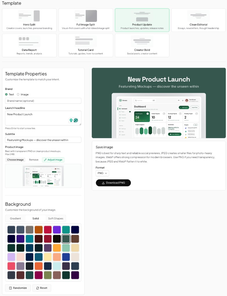
- Open the Open Graph format page or go straight to the editor with the OG preset.
- Pick a template that matches your tone (editorial, product update, minimal, and others).
- Edit the title and subtitle fields tied to the layout.
- Choose a background (solid, gradient, or shape preset) that keeps text readable.
- Export a PNG at 1200 × 630 px ready for your site metadata.
You work in the browser: no separate resize step and no guessing whether the export matches common social preview image size expectations.
Open Graph vs blog featured images
Both formats in FeatureImg currently use 1200 × 630 px, but they serve different jobs. An OG image supports link previews when a URL is shared. A blog featured image supports CMS cover slots on listing pages and article headers.
If your theme uses the same aspect for both, you can reuse styling, but many teams still export two files when crops or text density differ. For cover-specific guidance, see the blog featured image size guide.
Quick export checklist
- Design at 1200 × 630 px (FeatureImg OG format).
- Export PNG (or JPEG/WebP if your stack prefers and quality is acceptable).
- Upload the file to your host or CDN.
- Set
og:imageto the final absolute URL in page metadata. - Re-check the preview after deploy; caches can take time to refresh.
For layout inspiration by page type, see Open Graph image examples.
Create your next OG image
Use the size that platforms expect, keep copy minimal, and preview before you ship. When you are ready to build the asset, start from the Open Graph format page or open the OG editor preset to pick a template and export at the correct dimensions.