
What size should a blog featured image be?
Start with 1200 × 630 pixels (~1.91:1) for a wide blog featured image. It is a useful working size for a cover that may also appear in link previews. Your theme controls the displayed crop, so check its card and post-header settings before treating any pixel size as final.
| Dimension | 1200 × 630 px |
| Aspect ratio | ~1.91:1 |
| Main use case | Blog covers, CMS featured images, and listing thumbnails |
For a blog cover image size, first check the card ratio in your theme. If it uses a wide crop and gives no required dimensions, 1200 × 630 is a practical starting point. A square or 16:9 card needs a matching layout or a crop-safe design.
Need a cover at this size now? Open the Blog Featured Image format, pick a template, and export PNG at 1200 × 630—no manual resize.
What is a blog featured image?
A blog featured image (sometimes called a cover image or hero thumbnail) is the visual attached to a post in your content system. It often appears on:
- Blog index and category listing cards
- Author archive pages
- RSS and newsletter thumbnails
- In-article headers on some themes
It is not the same as every image inside your article body. The featured slot is usually one canonical asset per post, chosen in the CMS when you publish.
Size chart and common variants
| Use case | Typical size | Notes |
|---|---|---|
| FeatureImg blog featured export | 1200 × 630 px | Default preset; no manual resize |
| Wide hero banners (some themes) | 1280 × 720 px | 16:9; confirm theme docs before switching |
| Square card thumbnails | 1080 × 1080 px | Only when your theme explicitly uses square covers |
Check your theme documentation before export. The examples above are design starting points, not platform requirements.
WordPress, Ghost, and static CMS tips
| CMS / setup | Practical starting size | What to verify |
|---|---|---|
| WordPress | 1200 × 630 px | Theme Featured Image / thumbnail crop settings; some themes regenerate smaller sizes on upload |
| Ghost | 1200 × 630 px | Publication theme card and post header crops; keep text away from edges |
| Static sites (Next.js, Astro, Hugo, etc.) | 1200 × 630 px | Listing-card aspect ratio in your layout components; avoid hard-coding a different ratio without checking |
Responsive crops matter more than one “official” pixel size. Themes and layouts may clip sides or scale the image down for mobile cards. Keep logos and key words inside a safe central band, then preview the home page and single-post templates after upload.
Do not treat 1200 × 630 as a hard requirement for every theme. Use it as the default when docs are unclear, then adjust if your theme asks for a different aspect ratio.
Why wide images work well for blog cards
Listing pages usually show a horizontal thumbnail beside or above the title. Wide layouts use screen space efficiently and keep headlines scannable.
A consistent featured image size across posts also makes your archive look intentional: same aspect ratio, similar type scale, recognizable color cues. Readers spot your content faster when the grid feels cohesive rather than a mix of random crops.
How featured images differ from OG images
Both may look similar in dimension, but the intent differs:
| Blog featured image | Open Graph image | |
|---|---|---|
| Primary job | CMS cover / listing thumbnail | Link preview when a URL is shared |
| Typical metadata | Theme “featured image” field | og:image (and related tags) |
| Design focus | Readable at card size on your site | Readable in external social/chat previews |
| FeatureImg preset | Blog Featured Image | Open Graph Image |
In FeatureImg, both presets export at 1200 × 630 px today. Many teams reuse one design when the crop works everywhere. Others export two files when the CMS hero crop differs from how Slack or LinkedIn frames the link.
For link-preview-specific sizing and metadata tips, read the Open Graph image size guide.
Best practices for blog cover images
Use a clear title or visual focus. One idea per cover: a headline, a product screenshot with short copy, or a simple metaphor. Avoid cramming the whole article summary into the image.
Keep text readable. Use large type and high contrast. Remember the image may appear smaller than it looks in the editor.
Leave spacing around edges. Themes may round corners, apply gradients, or crop slightly. A safe margin keeps logos and words intact.
Stay consistent. Reuse layout patterns, colors, and type hierarchy so returning readers recognize your posts.
Avoid overly busy backgrounds. Fine textures and photo clutter compete with the title at thumbnail scale.
Common mistakes
Treating the cover like a full poster. Body content belongs in the article. The featured slot is a signpost, not the whole story.
Using too much text. Long subtitles and bullet lists rarely survive listing-page thumbnails.
Poor crop safety. Placing critical words in corners risks clipping on responsive themes.
Low contrast. Pale text on light backgrounds disappears on home-page grids.
How FeatureImg helps you create covers faster
FeatureImg focuses on publish-ready sizes so you spend less time fixing dimensions after export:
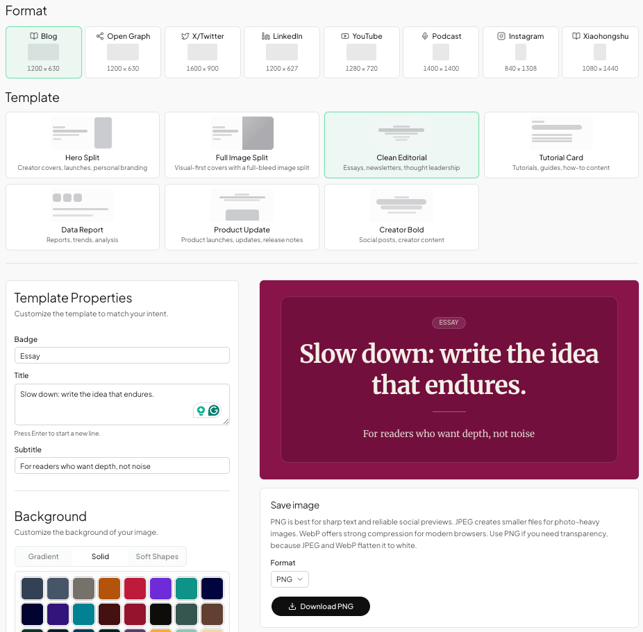
- Open the Blog Featured Image format page (canvas locked to 1200 × 630).
- Choose a template suited to editorial, product, or minimal layouts.
- Edit the title (and subtitle when the layout supports it).
- Pick a background style that keeps type legible.
- Export PNG and upload to your CMS featured-image field.
CMS upload workflow
- Export from FeatureImg at the target dimensions.
- Upload as the post’s featured or cover image in your CMS.
- Preview the home page and single-post templates if your theme crops differently in each view.
- Set or verify
og:imageseparately when your social preview needs different copy or cropping.
FAQ
What size should a WordPress featured image be?
WordPress has no single required featured image size. Themes can define image sizes and crop behavior. If your theme uses a wide card, 1200 × 630 px is a practical source image; otherwise follow the theme's specified ratio. See the WordPress theme handbook for how themes set featured image sizes.
What is the best blog cover image size for Ghost?
Start with 1200 × 630 px (~1.91:1). Ghost themes often use wide cards; keep critical text away from edges so mobile crops stay readable.
Is a blog featured image the same as an Open Graph image?
No. A featured image is for your CMS listings and headers. An Open Graph image is for link previews when a URL is shared. Dimensions can match, but the jobs differ—see the Open Graph image size guide.
What file format should I use for a featured image?
PNG is a safe default for sharp text and flat graphics. JPEG or WebP can work for photo-heavy covers when file size matters. Prefer clarity at thumbnail size over maximum compression.
Do I need a different size for mobile?
Usually not a second export. Use one wide master (1200 × 630) with safe margins; let the theme scale it. If your theme uses a square mobile crop, redesign for that ratio instead of stretching a wide image.
Blog featured vs OG at a glance
| Question | Blog featured | Open Graph |
|---|---|---|
| FeatureImg export (today) | 1200 × 630 px | 1200 × 630 px |
| Primary placement | Your site listings and headers | External link previews |
| Related guide | You are here | OG size guide |

Create your next blog cover
Pick a featured image size your theme supports, design for thumbnails first, and keep copy short. The Blog Featured Image format provides a 1200 × 630 canvas when you are ready to create the cover.