A clear LinkedIn post image size keeps your headline readable in the feed and saves you from resizing exports after design. This guide covers the dimensions FeatureImg uses for LinkedIn updates, when a wide visual helps, and practical layout habits for professional posts.
What is a LinkedIn post image?
A LinkedIn post image is the picture you attach when you publish an update in the feed. It appears above or beside your post text on desktop and mobile, and it often shows up again when someone reshares the update.
It is not your profile banner or company page cover. It is a single asset tied to one post: a headline visual, product screenshot, chart, or announcement graphic that supports the copy you write in the post body.
Recommended LinkedIn post image size
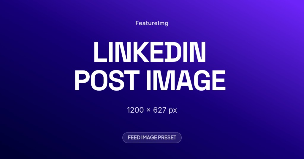
The most practical starting point for feed images is 1200 × 627 pixels (~1.91:1). FeatureImg’s LinkedIn Post format exports at that size so you can design on the correct canvas and download without a separate resize step.
| Label | Dimensions | Aspect ratio | When to use |
|---|---|---|---|
| FeatureImg LinkedIn Post export | 1200 × 627 px | ~1.91:1 | Default for single-image feed updates |
| Wider marketing assets | 1200 × 630 px | ~1.91:1 | Common OG size; close enough for many posts, but LinkedIn preset is 627 px tall |
| Square uploads | 1080 × 1080 px | 1:1 | Only when you intentionally want a square card; not the default feed image shape |
If your team already uses 1200 × 630 px assets from blog or Open Graph workflows, the difference is small. For new LinkedIn-only graphics, match the 1200 × 627 px preset so exports align with the format page and editor.
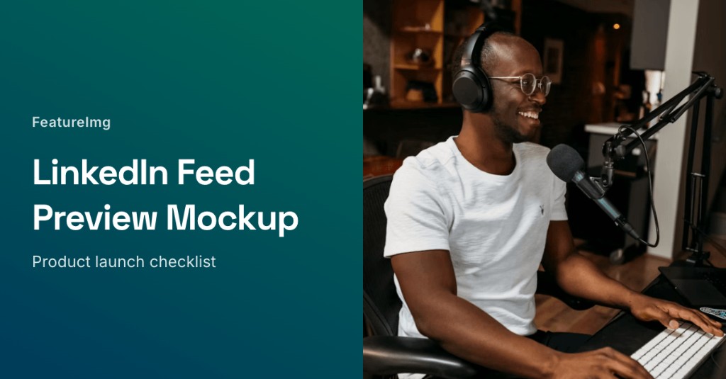
Why a wide image works well for LinkedIn updates
The LinkedIn feed favors horizontal images for single-image posts. A wide frame uses the available width, keeps type large enough to scan, and feels natural next to long-form post copy.
Wide layouts also separate roles cleanly: the image carries one visual promise (launch, lesson, metric, quote), and the post text carries context, links, and nuance. That split works well for B2B updates where readers skim before they expand a post.
When to use an image in a LinkedIn post
Reach for a designed image when:
- You announce a launch, report, or milestone and want the headline to survive the scroll
- You share a framework, checklist, or single data point that fits one frame
- You promote an article, webinar, or resource and need a visual hook beyond the link preview
- You post regularly and want a recognizable layout family across updates
Skip a custom image when a short text-only update is enough, or when a link preview already shows the right thumbnail and your copy does the selling.
Best practices for LinkedIn post images
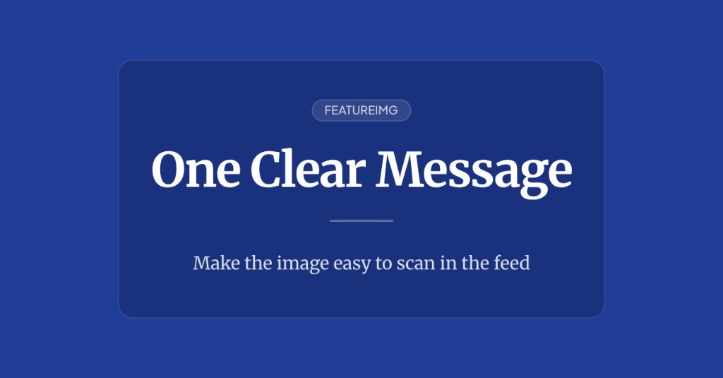
Use a readable headline. Aim for one clear line (often five to eight words). Feed thumbnails shrink fast; long sentences become noise.
Keep strong contrast. Light gray type on pale gradients fails on bright screens. Solid fields, simple gradients, or calm panels behind text usually hold up better.
Avoid small text. Fine print, dense bullets, and slide screenshots rarely survive mobile scrolling. If you need detail, put it in the post body.
One message per image. Pick a single takeaway: the metric, the launch name, the lesson title. Do not paste the whole post into the graphic.
Leave edge spacing. Clients can crop or round corners. Keep logos and words away from the outer edges.
Common mistakes
Screenshot text that is too small. A full product UI capture without a cropped focus area often looks muddy in the feed.
Cluttered slide exports. Deck slides with charts, footnotes, and logos compete at thumbnail size. Simplify to one headline and one visual anchor.
Low-contrast backgrounds. Pastel-on-pastel type disappears when the feed is busy.
Image copy that does not match the post. If the graphic promises one outcome and the post discusses another, readers hesitate to engage.
How FeatureImg helps you hit the right size
FeatureImg keeps the LinkedIn canvas locked while you design:
- Open the LinkedIn Post format page or the LinkedIn editor preset.
- Choose a template suited to your update (editorial, product launch, data point, or split layout).
- Edit the title and subtitle fields tied to the layout.
- Pick a background (solid, gradient, or shape preset) that keeps type readable.
- Export PNG, JPEG, or WebP at 1200 × 627 px and attach the file when you compose your post.
FeatureImg does not publish to LinkedIn for you. You export the file, then upload or attach it in your normal posting workflow.
For step-by-step creation tips, read how to create a LinkedIn post image. For layout direction by post type, see LinkedIn post image ideas.
Quick size checklist
- Design at 1200 × 627 px (FeatureImg LinkedIn Post format).
- Keep one headline idea per frame.
- Check contrast at a reduced zoom in the editor preview.
- Export and attach when composing the post (FeatureImg does not post for you).
Create your next LinkedIn post image
Pick the size your feed graphic needs, design for scrolling readers first, and keep copy short. When you are ready, start from the LinkedIn Post format page or open the LinkedIn editor preset to choose a template and export a clean image.