Looking for LinkedIn post image ideas that fit real B2B updates, not abstract design theory? This guide lists practical wide layouts by post type, notes when each idea works, and points to a fast way to test options on the correct canvas in FeatureImg.
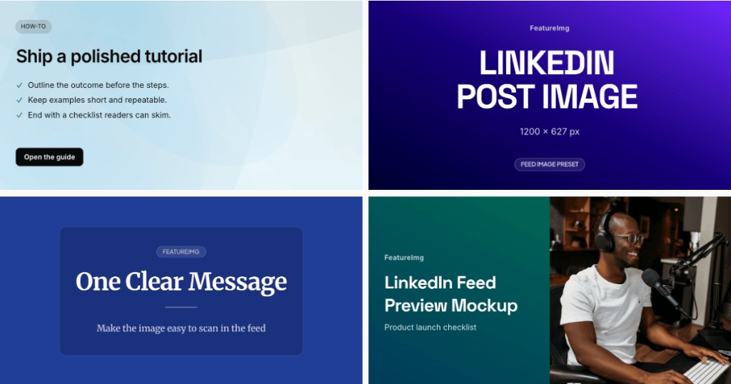
All ideas assume the LinkedIn Post export size: 1200 × 627 px on the LinkedIn Post format page.
Why LinkedIn post image ideas matter
Feed readers scroll quickly. An idea-first approach picks one visual promise per post: “launch”, “lesson”, “metric”, or “event”.
Ideas also reduce blank-canvas delay. You start from a template family instead of guessing layout from zero.
Idea: bold statement image
Fits: POV posts, industry takes, short manifesto lines.
Look: large headline, minimal extras, confident color field.
Tip: personality comes from type scale and palette, not extra badges.
Try clean editorial or a bold title template in the LinkedIn editor.
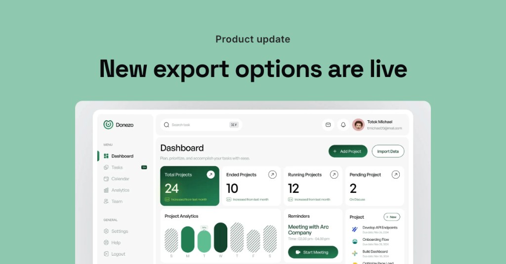
Idea: product update visual
Fits: feature launches, changelog posts, beta announcements.
Look: short headline, optional badge line, product screenshot or hero zone.
Tip: name the outcome in the title, not the internal codename.
The product update template matches this rhythm when you want a launch frame with room for a visual.
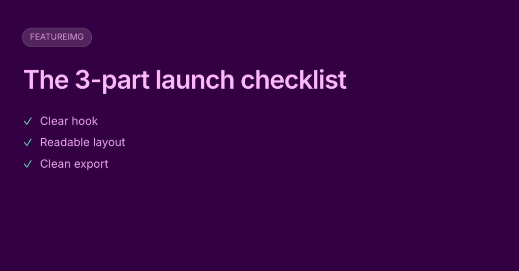
Idea: framework or checklist image
Fits: how-to posts, operating principles, team playbooks.
Look: framework name as the headline, three to five short labels max (not a full checklist).
Tip: put the detailed steps in the post body. The image should name the framework, not list every step.
Clean editorial or data report layouts can carry a structured label without feeling like a slide deck.
Idea: quote or lesson image
Fits: single insight posts, recap threads, teaching moments.
Look: one sentence as the headline, subdued subtitle optional.
Tip: if the quote is long, shorten it for the image and keep the full version in the post.
Idea: event or announcement image
Fits: webinars, office hours, report releases, hiring pushes.
Look: event name, date or format cue, one supporting line.
Tip: avoid cramming agenda bullets into the graphic. Link details in the post.
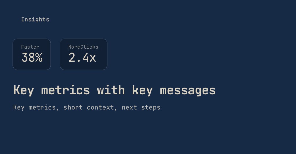
Idea: data point image
Fits: results posts, benchmark shares, quarterly snapshots.
Look: one or two metrics with a short headline that explains why the number matters.
Tip: round large numbers for scanability (“38% faster” beats a precise decimal in the feed).
The data report template is built for metric-led updates.
Idea: screenshot-led product image
Fits: demos, UI walkthroughs, before/after product stories.
Look: cropped UI plus headline panel (often via full image split).
Tip: never place small type directly on busy screenshots. Keep labels in the headline zone.
Idea: simple editorial image
Fits: essays, newsletters, long-form articles you promote in the feed.
Look: calm background, one headline, light subtitle, plenty of margin.
Tip: limit to two text lines. Let whitespace signal quality.
Clean editorial is the natural starting point.
How to choose the right idea for your post
| Post type | Starting idea | Template direction |
|---|---|---|
| Launch or release | Product update visual | Product update |
| POV or essay | Bold statement or editorial | Clean editorial |
| Framework post | Framework or checklist image | Clean editorial or data report |
| Metric share | Data point image | Data report |
| Demo or UI story | Screenshot-led product image | Full image split |
| Event promo | Event or announcement image | Product update or clean editorial |
Pick one idea, export, and reuse the same layout family across related posts. Consistency helps followers recognize your updates.
Mistakes to avoid
Too much text. URLs, paragraphs, and bullet stacks belong in the post, not on the feed image.
Tiny screenshot details. Interface chrome and footnotes rarely survive mobile scrolling.
Generic stock feel. Random office photos signal “placeholder update” instead of a specific story.
Low contrast. Pale type on light backgrounds disappears in busy feeds.
Repeating the post without adding value. If the image says the same sentence as the first line of your post, the visual does not earn its space.
Test layouts quickly in FeatureImg
- Open the LinkedIn Post format page to confirm size and templates.
- Launch the editor preset.
- Try two templates for the same headline (for example clean editorial vs product update).
- Swap backgrounds (solid, gradient, shape preset) without resizing the canvas.
- Export the strongest option at 1200 × 627 px.
You are comparing hierarchy and readability, not chasing a perfect illustration on day one.
Related guides
- LinkedIn post image size guide for dimensions and safe areas
- How to create a LinkedIn post image for step-by-step workflow
Create your LinkedIn post image
Pick one idea that matches your post type, keep the headline readable, and preview at feed scale. When you are ready, start from the LinkedIn Post format page or open the LinkedIn editor preset.