Looking for podcast cover ideas that fit real shows, not abstract design theory? This guide lists practical square layouts by show type, notes when each idea works, and points to a fast way to test options on the correct canvas in FeatureImg.
All ideas assume the Podcast Cover export size: 1400 × 1400 px on the Podcast Cover format page.
Why ideas matter before you design
Directory grids force fast judgments. Listeners scroll past dozens of squares. An idea-first approach picks one visual promise per show: “interview”, “solo expert”, “story”, or “course”.
Ideas also reduce blank-canvas delay. You start from a template family instead of guessing layout from zero.
Idea: bold title-only cover
Fits: named shows with a strong title, news briefs, opinion podcasts.
Look: large show name, minimal extras, confident color field.
Tip: personality comes from type scale and palette, not extra badges.
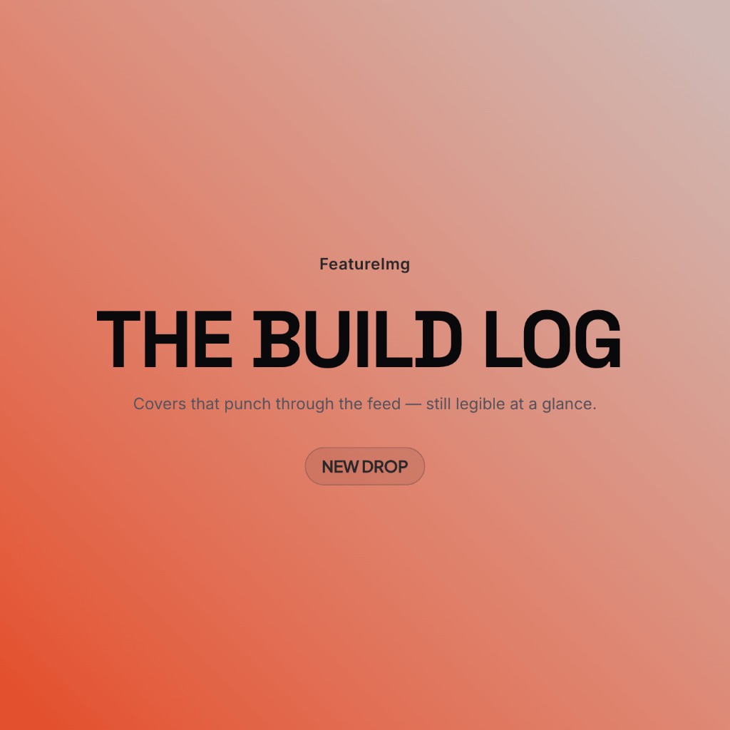
Try creator bold in the podcast editor.
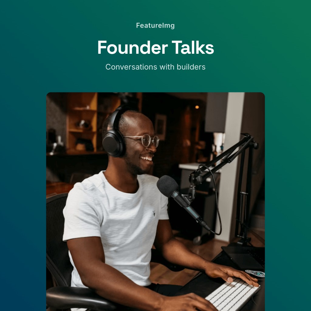
Idea: host portrait cover
Fits: personal brands, coaching shows, creator-led series.
Look: portrait zone plus title panel (often via a split-style template when you add a photo in supported layouts).
Tip: keep the face centered with margin; avoid tiny type on the photo itself.
Idea: interview show cover
Fits: conversation series, guest-driven shows.
Look: clean editorial hierarchy, calm background, optional “with [Host]” subtitle.
Tip: do not list upcoming guests on the cover; update show notes instead.
Clean editorial matches this tone.
Idea: business podcast cover
Fits: B2B topics, leadership, finance, operations.
Look: restrained palette, one headline, short topic subtitle.
Tip: avoid stock handshakes; solid color fields read more credible at small sizes.
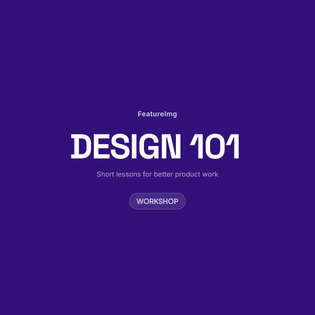
Idea: educational podcast cover
Fits: courses, explainers, skill-building series.
Look: clear title plus format cue (“Guide”, “Workshop”, “101”) in the subtitle.
Tip: one learning promise per line; skip syllabi on the artwork.
Tutorial card can work when you want a slightly more structured label.
Idea: storytelling or narrative cover
Fits: fiction, documentary audio, serialized stories.
Look: moody gradient or shape background, evocative title, little extra text.
Tip: atmosphere supports the title; do not hide the show name in texture.
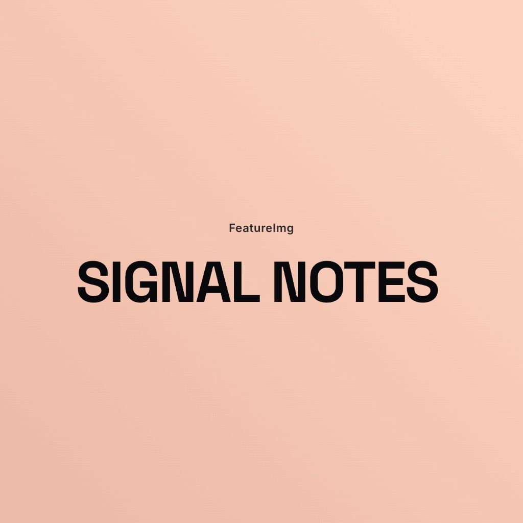
Idea: minimal gradient cover
Fits: tech, design, productivity, calm interview shows.
Look: soft gradient or shape preset, high-contrast title, no photo.
Tip: test readability on both light and dark app chrome.
Shape backgrounds in the editor help you iterate quickly without custom illustration.
Idea: illustration-led cover
Fits: kids shows, humor, niche hobbies with a mascot.
Look: simple illustration or icon plus bold title.
Tip: one focal character beats a busy scene.
Upload art only when the template supports a product or hero image slot; otherwise keep illustration inside the background or brand mark you own.
How to choose the right idea for your show
| Show type | Starting idea | Template direction |
|---|---|---|
| Solo expert | Title-only or portrait | Creator bold or Clean editorial |
| Interview | Calm title + host line | Clean editorial |
| Business | Restrained title + topic | Clean editorial or Product update |
| Education | Title + format label | Tutorial card or Clean editorial |
| Narrative | Mood gradient + title | Creator bold with shape background |
| Launch or season | Announcement headline | Product update |
Pick one idea, export, and live with it for a few episodes before redesigning. Consistency helps recognition.
Mistakes to avoid
Too much text. Episode numbers, URLs, and guest lists belong in descriptions.
Unreadable title. If you cannot read the show name at thumbnail size, simplify.
Generic stock feel. Random office photos signal “placeholder show”.
Low contrast. Pastel type on pastel backgrounds disappears in grids.
Frequent redesigns. Small tweaks are fine; wholesale style changes confuse returning listeners.
Test layouts quickly in FeatureImg
- Open the Podcast Cover format page to confirm size and templates.
- Launch the editor preset.
- Duplicate your approach across two templates (for example Clean editorial vs Creator bold).
- Swap backgrounds (solid, gradient, shape preset) without resizing the canvas.
- Export the strongest option at 1400 × 1400 px.
You are comparing hierarchy and readability, not chasing a perfect illustration on day one.
Pair ideas with real listing copy
Cover art works with the show title and description in your host. If the cover says “Design Notes” but the listing title is vague, listeners still hesitate. Align the cover headline with the name people search for.
The subtitle on the cover can echo one line from your description (topic, audience, or release cadence) without repeating the full paragraph.
When a free podcast cover maker search leads here
Queries such as podcast cover maker free or podcast cover art creator usually mean “I need square art without a heavy design suite.” FeatureImg runs in the browser with preset sizes and templates. You still choose copy and backgrounds, then export a file you upload yourself. There is no automatic publishing step inside the tool.
Related guides
- Podcast cover size guide for dimensions and platform notes
- How to make a podcast cover for step-by-step workflow
Create your podcast cover
Pick one idea that matches your show type, keep the title readable, and preview at thumbnail size. When you are ready, start from the Podcast Cover format page or open the podcast editor preset.